

Project Vision
Videsk is a job board platform with video-based resumes and job announcements. The website helps applicants to do job hunting and finds eligible candidates for recruiters.
Challenges
-
In the brief, it is written that the applicants have privilege for this platform. It is free for them. Contrarily, companies are charged.
-
The user as an applicant requires to get a response from recruiters even the result is negative. How to encourage company side to do.
-
Recording and editing videos are not familiar actions for most people when they are applying for a job.
MAIN GOAL
How the users with different needs remain active in the video-based job board website.
MY ROLE
I was the UX designer for the 4 weeks project. I conducted the market and user research, then designed the interface from the ground up.
PROCESS
With the knowledge of Lean UX, I started to think and need to explore how users are experiencing. I consider how I can solve the problems with my design. Finding answers to these, I did market research to check if there is any similar product to Videsk and analyzed existing job hunting platforms. After gathering information to do a SWOT analysis, I completed the chart to understand where the platform will have a place in the industry.
But SWOT analysis was not directly user-related. The industry-focused analysis did not help to understand users' drawbacks and dangers. So, I’ve used the User-Centered Business Canvas (UCBC), This technique reviews all essential aspects of the project (problems, competitors, users, revenue sources, metrics, challenges) and sums up the information in an easy to digest and visual format. It serves complete look of product.
UNDERSTANDING THE USER
I created User Personas to reflect the different user types of the product. Exploring the (problems/needs/goals) helped me understand a matter of priority of needs and ways to solve them. Thus, I created two personas, one for a candidate and one for a recruiter.
Especially I give a section about the situation of these personas to frame what kind of situation they find themselves in, with respect to their needs. By describing the way these personas currently address their needs or giving an account of how they go about their business during the day.


The action which is recording video is obligatory to complete the profile and it is unfamiliar action among people. They can be shy to attend the platform. To compensate for it, the platform has to be effortless with a few steps when they decide to attend it. Therefore, before I start to design by sketching, I created User Journeys for each User Persona to better understand the steps they go through when interacting with the product. The journey starts from the welcome page and ends with the membership and account page.

BREAKING DOWN THE PROCESS
I usually start with low-fidelity sketches before creating wireframes. First, I sketched out the home page of the platform for common guests. Then I differentiate the website for recruiters and applicants.

Basically, Videsk provides similar features for both users. However, the recruiters are paid, so different memberships require separate design flows.


Homepage of Videsk
Navigation Bar of in the homepage

The Navigation for Applicants
When the applicant is in the profile user icon will be blue and a few insights about profile already show up
After Creating Account, the website directs you into your profile and a quick intro starts automatically


I designed Job offers section by taking into consideration applicants' needs. Thus, I created a detailed Search Panel as a guide to look for more options.

Job Offers


A logo is catchy for images of brands but applicants remember the job offer with the presenter of a company in the video. Therefore I figured logo and thumbnails together to remembrance.

The most challenging part was to nail the feature section. It is used for recording, editing, and polishing the video.
Both users use the same design in this feature section. So, I made effort to keep it simple and comprehensible for both users. Quickly creating and iterating through lots of drafts helped me find the solution.
Features

.png)
.png)


This part was the backbone of the project as both candidates and recruiters would express themselves through video. Therefore, It has to be controllable before upload to profile.
Users can transcribe their content then it is analyzed repetition and tone of voice automatically.
Also, users have to be sure that they answered some basic questions in the video.
When the user confirms the information, the frozen screen on the right side clear up to select a thumbnail of the video then upload.
Both candidates and recruiters have questions about how they should shoot a video via Videsk and express themselves in the best way in this video. In the Tips section, they can reach resources to find answers.
Tips


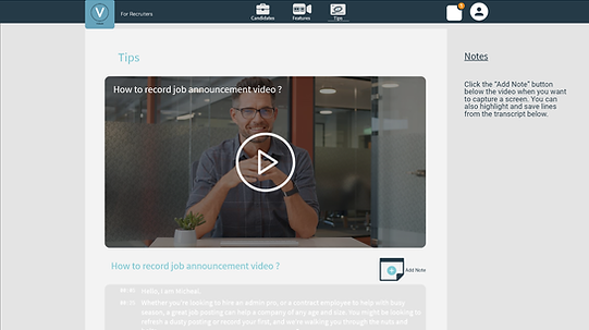

Add Note Button helps users to take notes digitally while they watch the video.
Videsk
For Recruiters


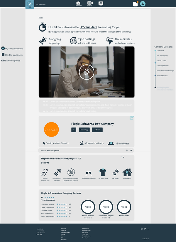

Most of the recruiters do a hard day's work, they can have difficulty memorizing how many applicants wait for a reply. Respond in time is a matter for success in the platform because each positive review contributes to the company's strength thus company increases the chance to be at the top of job offers.
Candidates
I have designed a similar Search Panel for recruiters to prioritize the qualifications they need and their expectations from candidates.


_gif.gif)
TITLE OF THE CALLOUT BLOCK
KEY TAKEAWAYS
This was my first project to create web design starting from zero and following the research and prototyping process. It was a project that I was very involved in because I am in the job search process. I made my own contributes especially looking for drawbacks about existing products and candidate expectations more.
It was a bit difficult to design for a platform works with videos whose examples are rare and have not regular use in our life. Even for the high fidelity prototyping process. Finding and choosing a true video with the context is a little bit tough.
-
It is challenging to make an uncommon way of CV (video resume) attractive through the interface design when applying for a job.
-
Even if I created it for two different users, the platform represents how Videsk looks like and design for it. So, I had to create a common design language and make feel it each part of the product.
-
The project aims to get two types of users who are applicants and candidates. I had to separate them in terms of usage and expectations from the platform. On the other hand, they have to engage each other at some point.
-
When it gives priority to applicants, I make an effort on creating win-win situations for recruiters. Because they are paying for the platform and their actions can contribute themselves positively or negatively. Each response to applicants, their company strength, and visibility will affect, as a result. So, each user has to have some advantages provided by the platform.